EnergyVille webinar & expert talk: Tools to support the energy transition of cities
As the energy transition gains momentum, EnergyVille/VITO aims to enable cities in coordinating local stakeholders to support and invest in the transition of the European energy system. To this end, several tools have been developed over the years and are constantly being refined and updated. In this expert talk with corresponding webinar, three of these tools are discussed and compared.
The webinar and expert talk were provided by Evi Lambie and Pieter Bosmans, researchers at the EnergyVille/VITO Smart Energy & Built Environment Unit. Both of them contribute to several projects that facilitate and support the energy transition, such as the NSR Interreg project ACCESS1 and the H2020 project oPEN Lab.
Webinar
Toolbox Presentation
Expert talk
1. Multi-energy vector Optimization and Assessment Tool
The Multi-energy vector Optimization and Assessment Tool (MOAT) is a multi-energy vector decision support tool for achieving Greenhouse Gas (GHG) emission reduction targets. It provides an overview of the different sectors that make up an energy landscape (residential, tertiary, industrial, agricultural, mobility…). The MOAT considers the energy consumption in the form of (fossil) fuels, electricity and heat. Potential Sustainable and Renewable Energy sources (SRE) such as solar, wind, heat and biomass can be quantified.
Its users can define and calculate scenarios and assess their impact (energy, CO2, financial) to assist in energy master planning. They can do this by combining the introduction of energy efficiency measures with the integration of SRE. The scenarios include a mix of technological measures such as district heating/cooling networks, building renovation measures and decentralized renewable energy production technologies. By taking all these technologies into account, the MOAT enables our clients to design their pathways to energy autonomous cities. Developed as a spreadsheet-based calculation tool, the MOAT is under the IP of EnergyVille/VITO.
What data are needed?
The required input data are, on the one hand, annual totals for the consumption (in kWh or MWh). These should include electricity and thermal energy, broken down by source. The consumption should be attributed to a specific sector (residential or tertiary buildings, industry, agriculture or mobility) in the selected region (city). In addition, the annual renewable and sustainable energy production (in kWh or MWh) should be added and broken down by source (solar, wind, biofuels and other sources such as ambient or waste heat).
In the Flemish context, reporting under the Covenant of Mayors provides sufficient information on all energy sources consumed at the city level. In addition, open data from the local DSO on the production of renewable energy sources at the municipal level are available.
Setting pathways and scenarios
For scenario development, it is important to add calculated data on the potential of additional Sustainable and Renewable Energy Sources (SRE) to the information on the state of affairs. This can be obtained by considering information on actual approved/planned projects or the calculated potential. For these calculations, the EnergyVille/VITO unit Environmental Modelling provides valuable insights based on geo-observation and aerial photographs. They can apply numerous boundary conditions to the generated maps to quantify the potential spatial distribution.
Moreover, the introduction of energy-saving measures, such as renovation work or the electrification of heat generation, must be quantified. The user should do this for all sectors considered. A useful tool to generate these scenarios for the residential sector is the EnergyVille/VITO’s Urban Energy Pathfinder (see below).
Visualizing the numbers
The MOAT uses an integrated visualization method to map the energy landscape. The column chart helps quantify the amounts of energy consumed and generated. This allows users to develop a balanced energy transition plan for a selected region or city. For this purpose, six steps are followed as illustrated in figure 1.
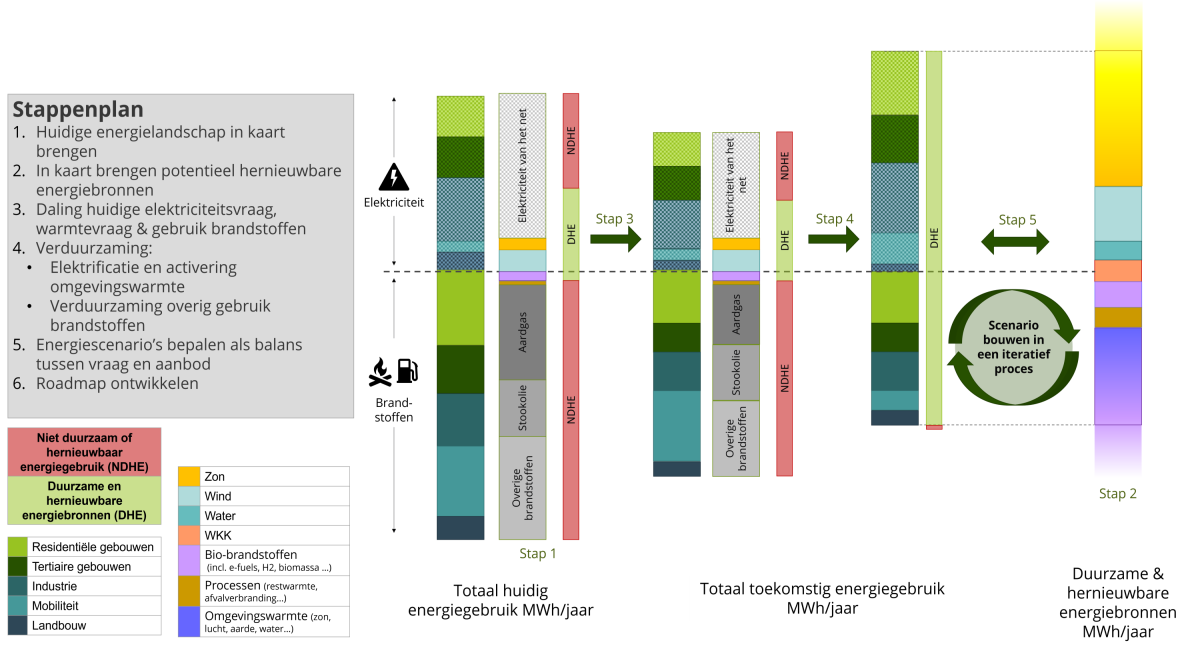 Figure 1: The methodology of the MOAT, visualized in a column chart
- On the left side of the chart, the current energy consumption is located by sector and by energy source. An additional label indicates whether the energy source is sustainable and renewable or not. Note that some of the grid electricity is also labeled as renewable. This is due to the presence of Sustainable and Renewable Energy Sources (SRE) in the specific energy mix provided by the grid.
- On the right side of the chart are the SRE (both current use and potential). The (im)balance between consumption and production is quite clear as they are mapped on the same scale on one axis.
- The quantification of all energy-saving measures is in the second column from the left. These measures can include both heat savings through building renovation and a modal shift to public transportation.
- Step 4 visualizes the decarbonization of the remaining energy demand. Through solar and wind power, it is quite simple to meet the electricity demand with the SRE electricity generation. Heat demand can be met with SRE by electrification (using heat pumps) or by replacing fossil fuels with biofuels, processes or ambient heat. Note that activating ambient heat through heat pumps requires an additional electricity input. Ideally, this should come from a renewable energy source. In the mobility sector, we can also note the efficiency gains from the electrification of engines.
- Finally, the decarbonization exercise is done by creating multiple scenarios in an iterative loop, as a balancing act between energy demand and SRE. Selecting a final scenario ultimately helps decision-makers create their energy master planning and roadmap. Note that only the annual basis is considered and the dynamic effects of the energy demand and generation are not taken into account.
2. Business-as-usual trendvisualization
The Business-as-usual (BAU) trend visualization is a quick scan visualization that creates a projection of when a balance between the energy consumption and the SRE production could be achieved. Its primary purpose is to be accessible to people who are not necessarily experts. They can generate a useful visual representation of where the current trajectory would lead. The amount of input data required is deliberately limited, and the resulting chart is easy to interpret.
It is a useful method to get an indication of whether the user is moving towards the ambition of energy balance or carbon neutrality. It can be considered a modest first step, before developing a full roadmap, created with the MOAT (as described above).
What data are needed?
The required inputs include the total amount of energy consumed and renewable energy generated for at least three previous years, as well as the total CO2 emissions. The years chosen must be representative and exclude, for example, years affected by the COVID-19 pandemic.
Visualising the path
The minimum of six data points will be plotted in the chart. For both the consumption and the SRE production, a trend line with error bars will show the estimated trend. This is illustrated in Figure 2.
The y-axis represents the amount of energy (in MWh), while the time axis is projected onto the x-axis.
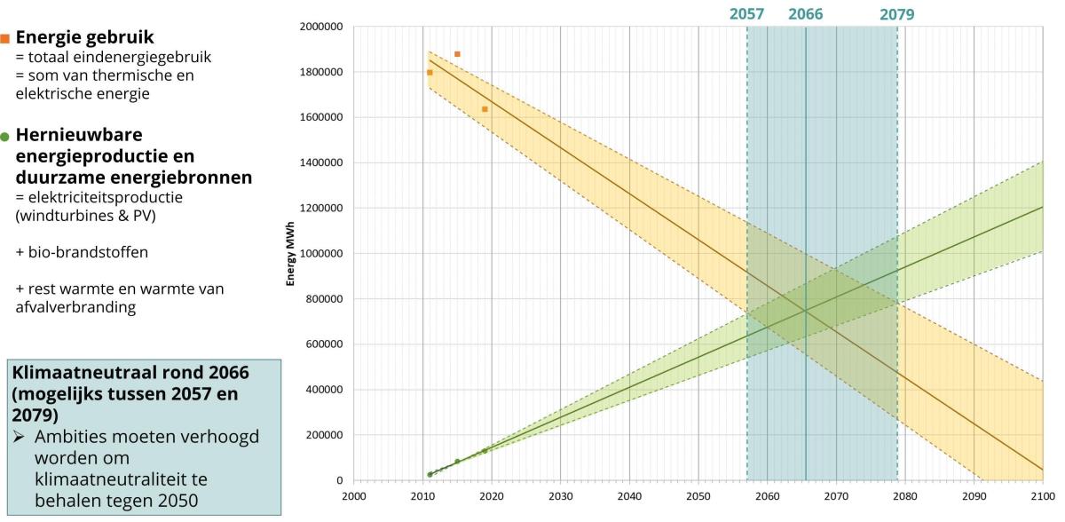 Figure 2: Illustration of the BAU trend visualization tool
Roughly linear growth is assumed for both the reductions in energy consumption and the growth in the use of Sustainable and Renewable Energy Sources (SRE). These trends may not be strictly linear. Therefore, the trend lines have been widened to reflect the number of uncertainties. An energy balance is achieved when a trajectory of reduced energy use and one of increased SRE production intersect.
Because of the series of trajectories, the resulting balance will not be a single intersection. It is rather represented by a diamond-shaped area. This can be interpreted as an area between the best and worst case scenarios.
The user must then confront this range with the stated goal. In many cases, most trajectories are unlikely to meet the ambition. This means that efforts must be stepped up to reduce the energy demand and increase the SRE production faster than in previous years. If most scenarios meet the ambition, the user knows he is on the right track.
In the example above, the net zero energy balance will not be reached until around 2066, far exceeding the 2050 goal.
Important disclaimer
The total final energy consumption and the SRE production are both simplified into one lump sum. Thus, no distinction is made between thermal and electrical energy.
In a holistic balancing exercise (such as the Multi-energy vector Optimization and Assessment Tool), the thermal energy use from fossil fuels, heat networks, etc. is balanced with the available thermal energy from renewable sources such a biofuels or heat (waste, ambient, residual). The electrical energy use is also balanced with the SRE electricity production via wind turbines and solar panels. This balancing exercise is beyond the scope of the BAU trend visualization described here. However, it should be considered when developing calculated energy transition paths.
Another important disclaimer is that the BAU trend visualization simplifies the complex interdependencies of the energy landscape. The resulting trend lines are estimates. They do not consider physical barriers such as a lack of available space to install solar panels, or financial barriers for homeowners to insulate their homes.
The results depend heavily on the relevance of the reference years considered. Years with a significant single change may skew the resulting trend line.
3. Urban Energy Pathfinder
The Urban Energy Pathfinder (UEP) is a web-based multi-layer decision support tool for regions and cities that want to deliberately move forward in the development of their energy transition trajectories. It provides a holistic energy solution by calculating energy, CO2 savings and financial conditions for renovation scenarios and energy technology measures at the building, district and city level.
The main difference between the MOAT and the UEP is that the MOAT is a top-down approach, while the UEP is a bottom-up approach. To develop an energy transition strategy, the MOAT assumes a city’s total energy use and total renewable energy production, broken down by sector. The UEP, on the other hand, calculates the total energy use for each building in the city, based on different data sets such as spatial models (GIS data) and detailed building models, and then aggregates all these data into a single figure per city. Both methods have advantages and disadvantages: the UEP requires a more detailed data set as input, while also being more complex and time-consuming than the MOAT. However, the UEP can provide a much more detailed insight into the effect of energy renovation measures in residential buildings, while also looking at the applicability of district heating networks.
Conclusions
Within several projects, EnergyVille/VITO has developed and further optimized energy tools for cities. In this article, three of these tools have been presented and compared. The summary of the three tools can be found in table 1.
|
|
MOAT |
BAU trend visualization tool |
UEP |
|---|---|---|---|
|
Full name |
Multi-energy vector Optimization and Assessment Tool. |
Business-as-usual trend visualization tool. |
Urban Energy Pathfinder. |
|
What? |
A spreadsheet-based calculation tool to analyze energy consumption and production, & to project calculated custom scenarios that decarbonize a city’s energy landscape. |
Quick scan visualization tool that creates a projection of when an envisioned energy landscape will achieve a balance between energy consumption and renewable energy production. |
Web-based multi-layer decision support tool that calculates energy, CO2 savings and financial conditions for renovation scenarios and energy technology measures at the building, district and city levels. |
|
Input? |
Total electricity use and thermal energy use (from fossil fuels and other fuels) by sector and total renewable energy production by renewable energy source. |
The total amount of energy consumed and renewable energy generated for three years. |
Detailed building information: various data sources at different levels of aggregation are linked together. |
|
Result? |
Column chart that can be used for energy transition planning. |
Trendline diagram that creates a projection of when an envisioned energy landscape will reach a balance between energy consumption and renewable energy production. |
Results of energy, CO2 savings and financial conditions for renovation scenarios and energy technology measures at the building, district and city levels. |
1ACCESS is a European project from the Interreg North Sea Region programme, funded by the European Regional Development Fund (ERDF).
Local authorities Amersfoort (NL), West Suffolk Council (UK), Malmö (SE) and Mechelen (BE) have jointly explored and demonstrated approaches at scale in pilot projects. These include local hubs for energy communities, peer-to-peer models for energy trading and local tools for collaborative planning. Support from four knowledge partners (Aarhus University, Johannesberg Science Park, ifM ECS, EnergyVille/VITO) provided expertise and structure.
In the ACCESS project, EnergyVille/VITO is not only knowledge partner but also project coordinator, with support from Province of Antwerp. Within ACCESS, EnergyVille/VITO improved two existing decision support tools for cities: the Multi-energy vector Optimization and Assessment Tool (MOAT) and the Urban Energy Pathfinder (UEP).
![]()
![]()